ROS A2 Media
Monday, 10 January 2011
Location
We chose to film parts in a basement as it gave an eerie feel to the trailer and gave a sense of horror and darkness. Some was filmed next to a train station in an alley way to give a sense of confinement in where they were walking, to add a sense of voyeurism and being watched. A shed was where the bulk of the filming took place. It is a secret place a very masculine stereotypical place Once again giving a sense of confinement and entrapment.
Evaluation Question 1
Evaluation question 1
In what ways does your media product use, develop or change forms and conventions of real media texts?
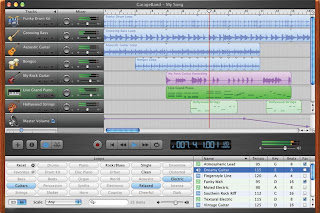
We used media technologies in the new construction and research in the planning and evaluation stages by using websites such as youtube this helped us as gave us ideas for our horror and so we could see what types of horrors people liked it. It helped us identify conventions normally found in horror and these conventions were lots of screaming, gory images and violence, and it was all set in the night time. We found that the night time was really effective so we decided to film it in the night time. we wanted to make our trailer unique and not just have darkness so we used candles to create a sinister effect and we found that lighting is really important to create a scary effect and using candles really helped to create it. Music is also important for creating tension we used garage band to create this and the music is very dark, and creates good tension for our horror.
Our film poster has a lot of normal conventions we used ideas from the poster from the hills have eyes 2 to create out poster. To make our poster effective and to convey the conventions we used shots that we found was the most eye catching. we used two pictures to show the scenes of the girls being tortured and another of a crazy doctor. To create this poster we used photo shop
The text that we used was thought about carefully, we used the magazine empire to get ideas by looking at there texts and how they used them gave us ideas for ours. We used quotes from news papers to make it seem more realistic, and so it shows that its got good ratings and i high publicity. The tag line we used
our magazine front cover used Empire to get the same sort if layout as we wanted it to look professional. we used large bold headings so it stood out and was eye catching. we used the colour red for out writing as it shows horror to represent our horror as it involves blood and gore.

On our magazine front cover we made sure the name of our film ‘splice” was bold so that it attracted peoples attention. we decided to have to have a picture of a hand and a knife instead of people, we based this on saw’s magazine. This shows its more of a horror and will contain death and pain because of the knife. We used the quote saying ‘ The uk’s no.1 Film magazine for 2010 this made the magazine look more effective as this is what would be used in a real magazine front cover.
In what ways does your media product use, develop or change forms and conventions of real media texts?
We used media technologies in the new construction and research in the planning and evaluation stages by using websites such as youtube this helped us as gave us ideas for our horror and so we could see what types of horrors people liked it. It helped us identify conventions normally found in horror and these conventions were lots of screaming, gory images and violence, and it was all set in the night time. We found that the night time was really effective so we decided to film it in the night time. we wanted to make our trailer unique and not just have darkness so we used candles to create a sinister effect and we found that lighting is really important to create a scary effect and using candles really helped to create it. Music is also important for creating tension we used garage band to create this and the music is very dark, and creates good tension for our horror.

Our film poster has a lot of normal conventions we used ideas from the poster from the hills have eyes 2 to create out poster. To make our poster effective and to convey the conventions we used shots that we found was the most eye catching. we used two pictures to show the scenes of the girls being tortured and another of a crazy doctor. To create this poster we used photo shop
The text that we used was thought about carefully, we used the magazine empire to get ideas by looking at there texts and how they used them gave us ideas for ours. We used quotes from news papers to make it seem more realistic, and so it shows that its got good ratings and i high publicity. The tag line we used
our magazine front cover used Empire to get the same sort if layout as we wanted it to look professional. we used large bold headings so it stood out and was eye catching. we used the colour red for out writing as it shows horror to represent our horror as it involves blood and gore.

On our magazine front cover we made sure the name of our film ‘splice” was bold so that it attracted peoples attention. we decided to have to have a picture of a hand and a knife instead of people, we based this on saw’s magazine. This shows its more of a horror and will contain death and pain because of the knife. We used the quote saying ‘ The uk’s no.1 Film magazine for 2010 this made the magazine look more effective as this is what would be used in a real magazine front cover.
Evaluation Question 2
Evaluation question 2
How effective is the combination of your main products and ancillary texts?
The poster and our magazine front cover was very effective, we spent a lot of time thinking about how to create these the match out trailer and so it was suitable for a target audience. We used the same font and effect in out trailer as we did in our poster and front cover. This helped them all link together. The poster we felt gave the trailer the sinister feel that was needed. Also our catch line “ the first cut is always the deepest” worked well with the trailer as it involves lots of blood and knifes and saws. For our magazine we thought we would do an exclusive interview with the director of the film as it would give an insight in to the movie for the reader of the magazine is what would be seen in a real magazine so we thought this gave it a sense of realism. This also shows the the film has high ratings so it would make people want to see it more.They Both compliment the trailer and create a interested audience through different types of advertisement
Evaluation Question 4
How did you use new media technologies in the construction and research, planning and evaluation stages?
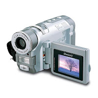
A lot of new media technology was used to make the trailer, we filmed the trailer with a video camera and we then transferd the footage to the computer and then on to final cut pro to create the trailer. we used final cut pro to alter the speed through out the trailer and to make a jump shot towards the end the create more suspense and to make the audience think that the trailer was over and the end was not expected. At first it was not as easy as we thought it would be to create good effects on the footage but after playing around with it we was able to create the effect we wanted and we was able to used final cut pro.
We used photo shop for the magazine front cover and film poster we was able to use various effects and to create a horrific effect. on the poster we was able to create a more dramatic bloody effect with the knifes. We also used a dark effect to make it look more horror like and so the blood was able to stand out more We also felt that us a negative effect on the knifes which made it look more eye catching then if it was just to be a normal effect on the knifes it looked more chilling and showed the knifes was to be used for killing. Also we was able to make the magazine front cover look more professional and look more realistic by using photo shop.
We also used garage band to create a heart beat effect, we also used music from a copy right free website as we was not allowed to use music from youtube or itunes. But we was really pleased with the music we had a really worked well with the footage.
http://freeplaymusic.com/ - this is a link to the website used
In the planning and research we used other new media technologies we used pages for the story board a it was already laid out for us which made it easier and all we had to do was to add the pictures and write what shots were used. We also used a mac program called ‘ispiration’ to create a mind map on our thriller ideas we felt that this will look more eye catching on the blog and was more creative. We also used motion to create our intertitles and the tittle of our main features this created professional look to the trailer
overall we was pleased with the out comes of using photo shop we was able to create a dramatic film poster and magazine front cover and it made them look very professional. Also using final cut pro we was able to create good effects to make the film more horror like.

A lot of new media technology was used to make the trailer, we filmed the trailer with a video camera and we then transferd the footage to the computer and then on to final cut pro to create the trailer. we used final cut pro to alter the speed through out the trailer and to make a jump shot towards the end the create more suspense and to make the audience think that the trailer was over and the end was not expected. At first it was not as easy as we thought it would be to create good effects on the footage but after playing around with it we was able to create the effect we wanted and we was able to used final cut pro.

We used photo shop for the magazine front cover and film poster we was able to use various effects and to create a horrific effect. on the poster we was able to create a more dramatic bloody effect with the knifes. We also used a dark effect to make it look more horror like and so the blood was able to stand out more We also felt that us a negative effect on the knifes which made it look more eye catching then if it was just to be a normal effect on the knifes it looked more chilling and showed the knifes was to be used for killing. Also we was able to make the magazine front cover look more professional and look more realistic by using photo shop.
We also used garage band to create a heart beat effect, we also used music from a copy right free website as we was not allowed to use music from youtube or itunes. But we was really pleased with the music we had a really worked well with the footage.
http://freeplaymusic.com/ - this is a link to the website used
In the planning and research we used other new media technologies we used pages for the story board a it was already laid out for us which made it easier and all we had to do was to add the pictures and write what shots were used. We also used a mac program called ‘ispiration’ to create a mind map on our thriller ideas we felt that this will look more eye catching on the blog and was more creative. We also used motion to create our intertitles and the tittle of our main features this created professional look to the trailer
overall we was pleased with the out comes of using photo shop we was able to create a dramatic film poster and magazine front cover and it made them look very professional. Also using final cut pro we was able to create good effects to make the film more horror like.
Friday, 7 January 2011
Final Script of 'Splice'
SPLICE
by
Rhianne, Sam, Olivia
Int. scene - description
long shot of two girls walking along path seen through the eyes of person watching them through the bushes.
shot - description
panning shot of collage of girls
shot - description
Two girls tied up in a shed
crazy doctor playing around with the bloodied tools
Close up of girls faces and close up on tools and swinging saw
Character name
jess and lucy as the two girls
sam as the crazy doctor
ext. scene - description
Long shot of the crazy doctor
shot of the title of the film
Draft Script
This was the working script before we came up with our final idea. We decided that the story did not work.
SPLICE
by
Rhianne, Sam, Olivia Int. scene - description
Two young girls get stranded after there car brakes down. They go walking for help.
olivia foran
rhianne roberts
There is quick cut to room where been kidnaped and they are tied up
shot - description
Middle shot of two girls sitting in the broken down car.
Long Shot of Two girls walking to find help
Close Ups of girls faces
Character name
Sam Fowler.
ext. scene - description
Shots of girl in the dark room
close ups of the girls face and the doctors faced
point of view shots
Character name
Rhianne Roberts
(screaming)
Character name
Olivia foran
(screaming) calling at rhianne’s name
Hills Have Eyes 2 teaser trailer.
Hills Have Eyes 2 teaser trailer.
1.At what point in the trailer are we told the name of the film? Why is this?
We are not told the name of the film until only a few seconds of the trailer remains . This is to ensure that the aduience focus on the trailer, another reason the name is saved until the end is to make sure that the audience rember it i
2.Why are we told who is staring in the film?
The audience are not told any of the names of the actors who are staring in the film, which is a convention assosiated with teaser trailers.
3.How is this information given to us ? why?
The information about who is staring in the film is not conveyed to the auidence, this is because the actors are not known and therefore not a selling point.
4.what type of action do we see in the film?
The main action scene focuses on a point of view shot of a man watching his friend being dragged across the desert floor , his also bound and gagged ,the point of view shot continues with the man himself starting to be dragged in the same direction
5.what clues does the music give us to what type of film the trailer is advertising?
The use on contrapuntual sound contrasts drmatically with the images shown on screen, but the lyrics imply death and suffering.
6.Does the trailer come with a voice over?
There is no voice over, the trailer relaise on captions and titles
7.Why do you think this voice was chosen?
No voice over is chosen
8.How does the speed of what we see compare to watching a film clip from a film? why is this?
Contrary to the conventions used in most trailers , the pace remains constant and reflects the speed of the lyrics
9.Does the speed alter?
No its just one speed throughout the whole thing.
10.What information are we given about the film?
The name of the film,
The realease date
11.What type of audience is the trailer aimed at? how can you tell?
According the pearl and Dean website The trailer is aimed at the ages of 15 and over as it is seems to be quite disturbing and shows people being tied up and dragged along the floor.
Subscribe to:
Comments (Atom)